


Psychology graduate and early-career Human Factors practitioner interested in how people understand, trust and interact with systems, particularly in transport safety, automated vehicles, user experience and human-computer interaction.
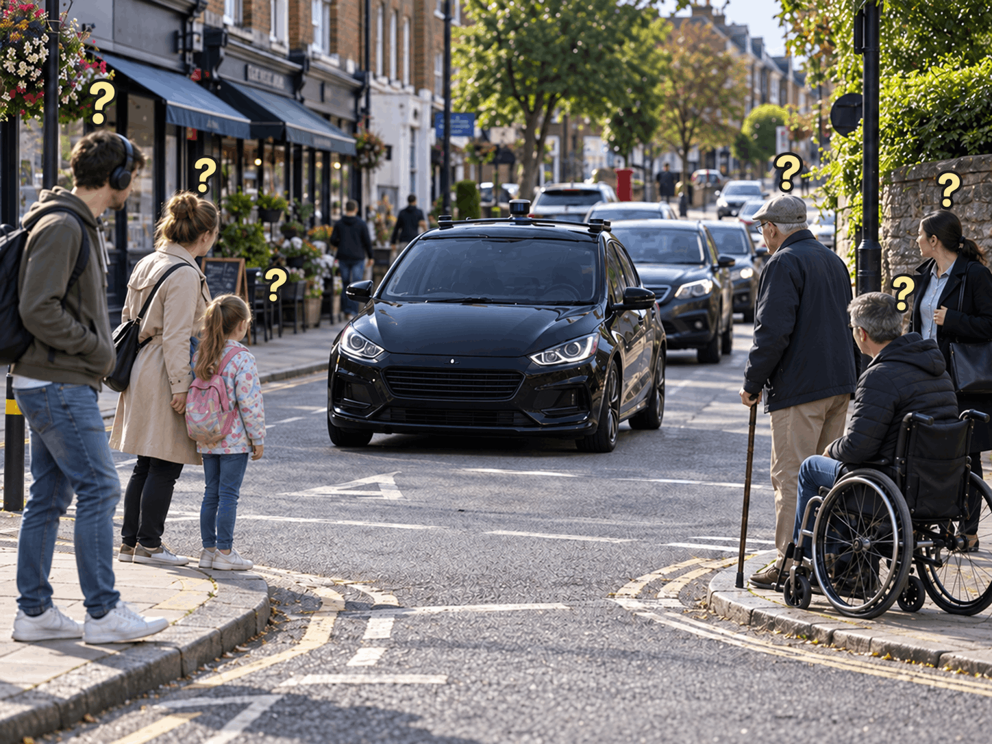
Pedestrians often look to drivers for eye contact or hand gestures. But what happens when the vehicle is driving itself?
I designed an independent Human Factors experiment to test whether external vehicle displays can replace missing driver cues. Seventy-four adults judged five versions of the same road scene. I measured what they believed the vehicle would do, whether they would cross, and how safe, trustworthy and clear each display felt.
Automated vehicles may remove eye contact and hand gestures when pedestrians must make a safety-critical decision. External human-machine interfaces, or eHMIs, aim to replace those cues using text, colour, symbols or sound. However, detection is not understanding: Red could mean the vehicle will stop or the pedestrian must stop.
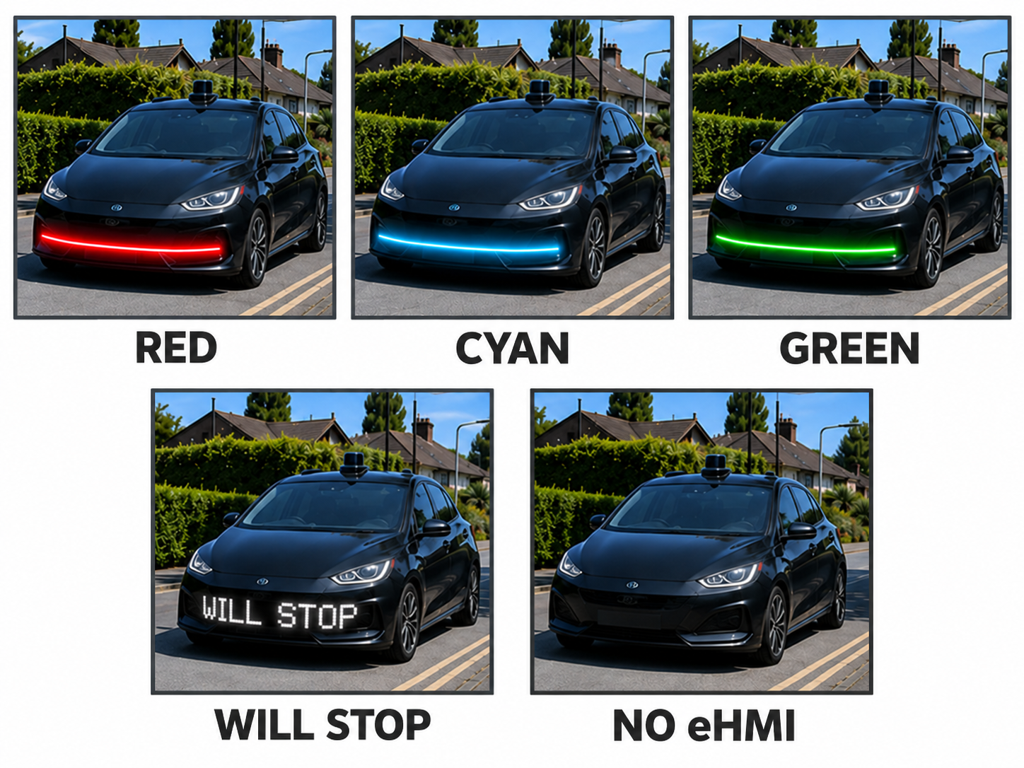
I built a mixed-design online experiment in Qualtrics. Seventy-four adults viewed five randomised, controlled road scenes showing Red, Cyan, Green, WILL STOP or No eHMI. Presentation duration was varied between groups at two or five seconds. After every scene, participants reported display recognition, vehicle intention and crossing choice, then rated safety, trust, clarity and confidence.
I analysed ordinal ratings and categorical decisions in R using mixed-effects models for repeated responses. Open comments were coded thematically. Combining both forms of evidence showed which display performed best and why signals produced different meanings.


Subjective clarity did not guarantee shared understanding. People who thought Red meant Stop and those who thought it meant Continue both gave median clarity ratings of 4. WILL STOP produced the strongest agreement. Average scores can therefore hide a safety problem: people may feel equally certain while reaching opposite conclusions.
WILL STOP communicated intended action more consistently than colour alone, but understanding it did not automatically make pedestrians cross. Red and Green carried competing meanings, while Cyan was visible but not self-explanatory. Extra viewing time did not help. An eHMI should support judgement of vehicle movement and the wider road situation, not replace it.
These projects demonstrate the breadth of my practice across physical ergonomics, occupational safety, UX evaluation and qualitative user research.
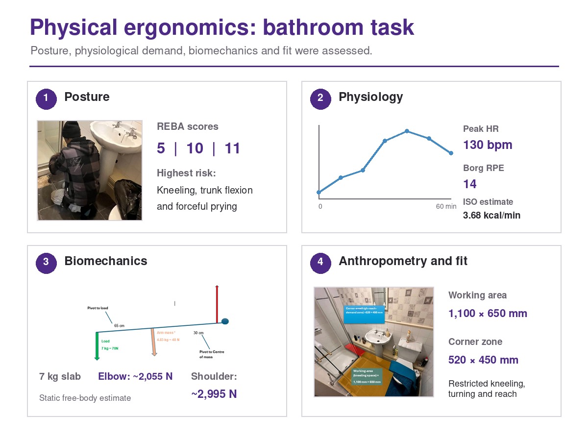
I assessed a 60-minute bathroom slab-removal task using posture, physiological, biomechanical and anthropometric methods. REBA scores ranged from 5 during setup to 11 during slab release. Heart rate rose from about 80 to 130 bpm, with a Borg RPE of 14. A free-body analysis of a 7 kg slab estimated muscle forces of 2,055 N at the elbow and 2,995 N at the shoulder. Measurements of the 1,100 × 650 mm working area also showed how fixed fixtures restricted kneeling, turning and reach. Recommendations included progressive loosening, two-handed handling, a support surface, extended tools and short micro-breaks.
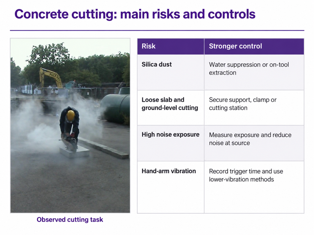
I completed a structured occupational ergonomics assessment of a real concrete-cutting task, combining video observation, hazard identification, legislation and a prioritised action plan. I identified critical risks from respirable crystalline silica and unsafe cutting, plus high risks from noise, hand-arm vibration, unstable slab support and ground-level working. Using COSHH, PUWER and the Noise and Vibration Regulations, I prioritised pre-cut materials, water suppression or extraction, secure support, exposure measurement and lower-vibration methods before PPE.

I helped develop HealthLink through a iterative design process that moved from brainstorming and storyboarding to dot voting, paper prototyping and usability testing. I then planned and delivered a mixed-method evaluation with six participants, combining think-aloud, task completion, time, errors, first-click behaviour, SEQ and SUS. The mean SUS score was 65/100; the Connect task took longest and received the lowest ease rating. Using the findings and ISO 9241-110, I redesigned the interaction as an explicit, reversible request flow with confirmation and visible block, report and leave controls.

I investigated everyday laundry use through naturalistic observation and semi-structured interviews with three regular users across home and student settings. Video observations became individual Hierarchical Task Analyses and a shared task model, while interview transcripts were coded thematically. Triangulating both methods revealed physical strain during loading, constrained control during programme selection, and uncertainty about damage, efficiency and wash outcomes. I translated the findings into design requirements for clearer programme information, transparent feedback and better physical access.