Branding and packaging designer using expressive illustration to create authentic, human and accessible visual identities. My work blends clarity, character and research‑driven thinking to help everyday audiences connect with brands in meaningful, relatable ways.
“WHAT THE FIBRE?!”
A fibre-first sub-brand for emerging adults, using humour and hand-drawn illustration to make nutrition culturally relevant.
“WHAT THE FIBRE?!” reframes standard beans as culturally meaningful staples through expressive packaging, clear hierarchy and everyday contexts. The system aligns with Lidl’s playful brand identity while introducing a fresh, humanised visual language that supports fast, convenience‑led shopping habits. In a decade dominated by AI‑generated design, this project champions authentic illustration to connect with Gen Z and make fibre visible, relatable and easy to choose.
A bold packaging system designed to make emerging adults, 18-25, rethink a forgotten staple.
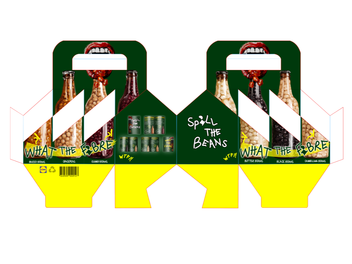
The project delivers a complete fibre‑first product system, including a full bean bottle range with designed caps, neck labels and expressive front illustrations. An additional bottle holder enables multi‑pack sales and reinforces a tactile, material‑led brand moment. At the same time, an accompanying recipe pamphlet integrates fibre-rich beans into everyday meals with simple, affordable guidance. Together, these outputs form a cohesive, humanised packaging ecosystem that makes fibre visible, usable and culturally relevant for emerging adults.
A flat zine net showing how the recipe system translates into a simple, affordable, print-friendly format for emerging adults.A set of bottles that each share a unique fibre fact, designed to spark small, gradual shifts in everyday dialogue.
A fibre‑forward holder that brings bean diversity together in one bold, everyday pack.Lidl’s “I”, reimagined as a bean: a tiny detail that makes fibre part of the brand story.
Leveraging Protein’s Success to Elevate Fibre
Drawing on the effectiveness of protein‑dominant supermarket cues, this rebrand reintroduces beans into recognisable spaces to showcase their diversity and everyday value. By adopting the clarity, confidence and shelf impact that made protein marketing so influential, the identity positions fibre as modern, relevant and easy to choose. With dietary behaviours established largely between 18–25, this age group is essential for driving long-term fibre engagement.
A Lidl‑aligned packaging system reimagined with a fresh, unique identity that makes fibre‑dense beans stand out.
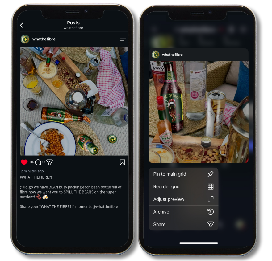
A beer‑bottle shape that playfully borrows from social drinking culture, turning fibre‑dense beans into something emerging adults actually notice.
A Practical Fibre Guide that “Spills the Beans” on Easy, Everyday Ways to Boost Fibre Without Changing Your Whole Routine.